CTRL,
Valentin Yeo changed the status from Implement (Rimma/Arbaz) to Wins
Loading...
Assignees
The Assignees
Agents
No agents
ID
TEET-89
Status
Wins
Due date
-
Project
Teethlovers
Priority
Urgent
Task size
-
Tags
No tags
 Valentin Yeo
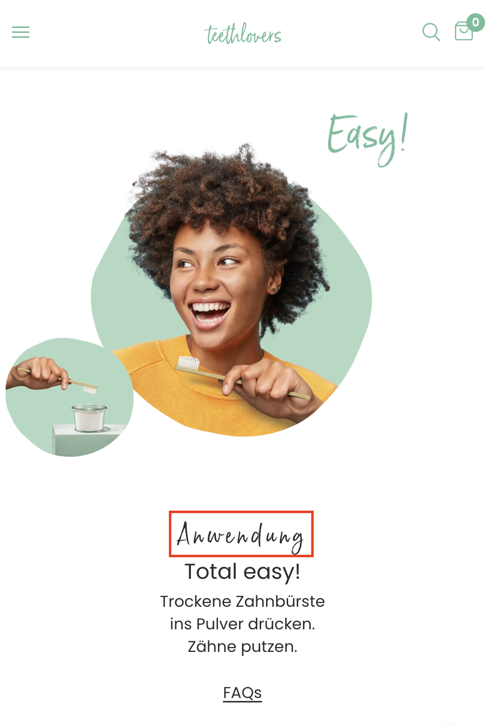
The current label “Anwendung” (Application) may not be the most intuitive or emotionally engaging for users scanning the page. Visitors may skim past this label without fully realizing that this is a step-by-step usage guide, potentially lowering engagement and comprehension.
To improve comprehension and visual clarity of the usage steps by testing alternative, more intuitive or emotionally resonant headings. The goal is to increase time spent on this section, improve scroll depth, and encourage first-time users to try the product.
If we replace the generic term “Anwendung” / “Application” with a more action-oriented or benefit-driven label, then more users will understand that this section shows how the product works, leading to higher engagement and increased conversion from first-time visitors, because clear, benefit-oriented section headings improve information retention and emotional connection.
German: Anwendung
English: Application
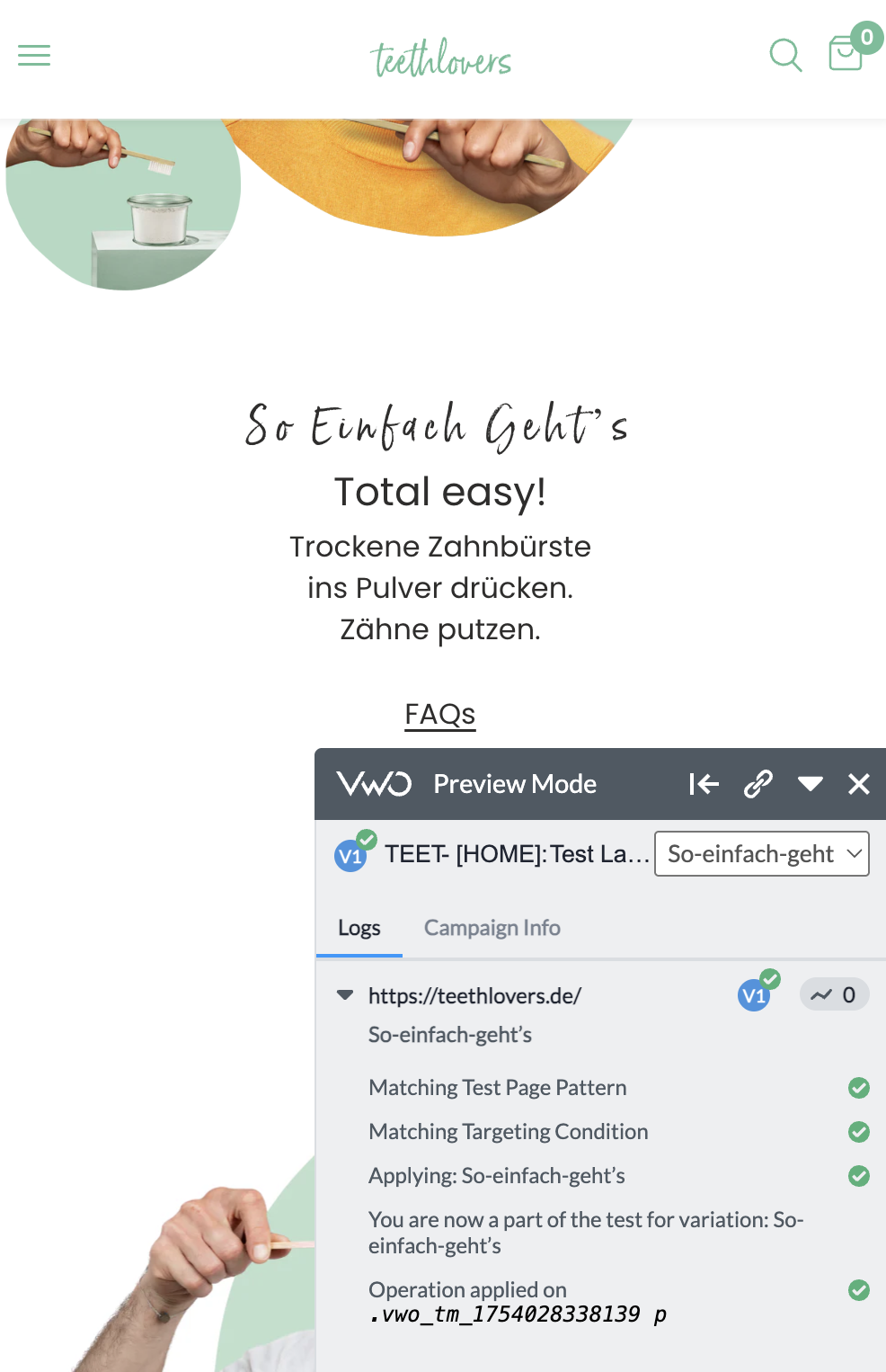
German: So einfach geht’s
English: So easy to use
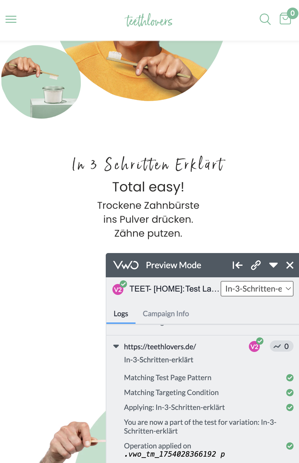
German: In 3 Schritten erklärt
English: Explained in 3 steps
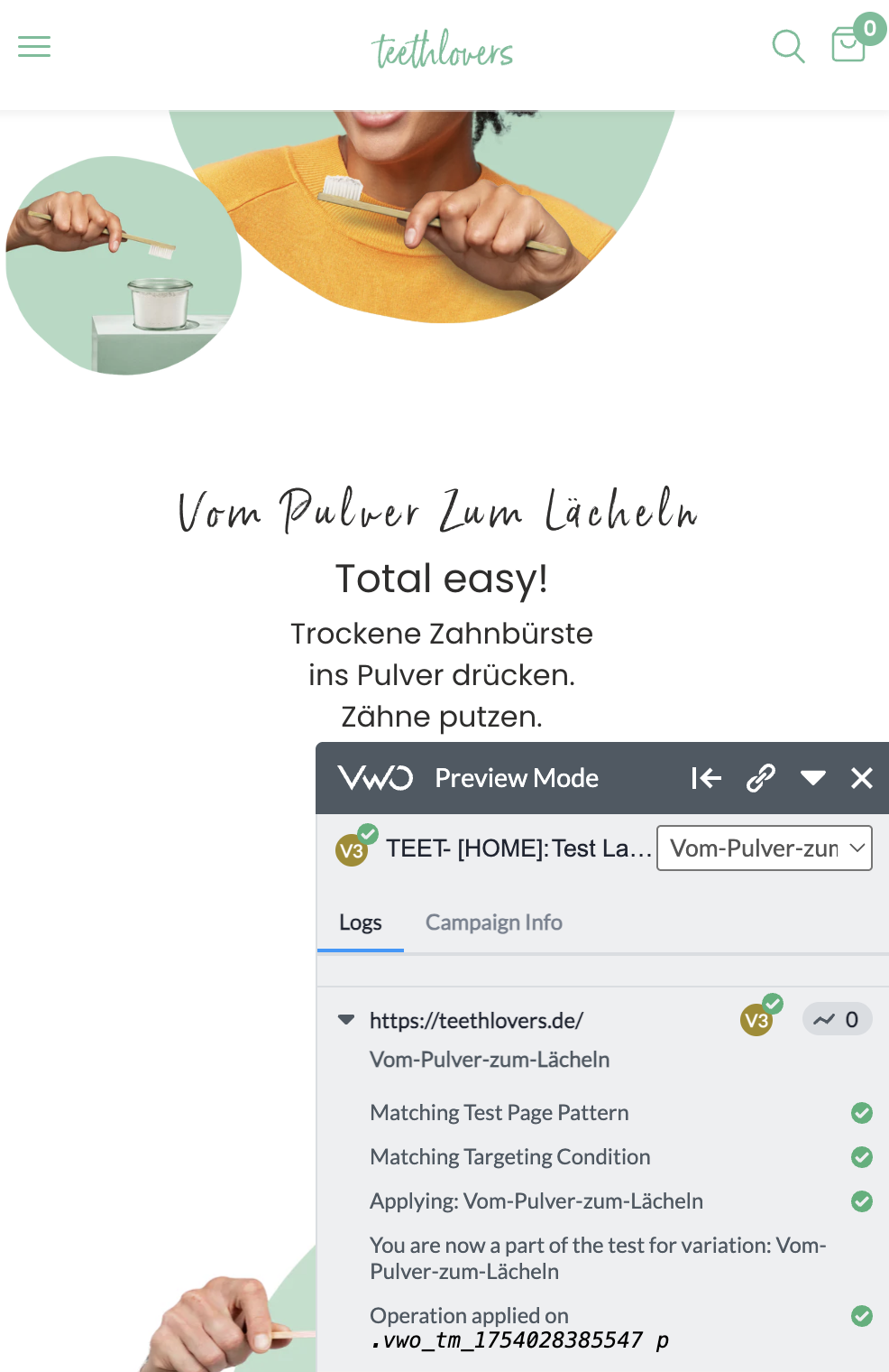
German: Vom Pulver zum Lächeln
English: From powder to smile
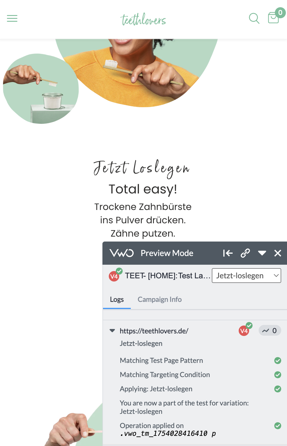
German: Jetzt loslegen
English: Let’s get started
Impact (8/10): Label is one of the first anchors in this module. Changing it can shift perception of clarity and usability.
Confidence (7/10): Based on patterns seen on high-converting DTC and beauty sites (e.g., HelloBody, SmileSecret), section labels that emphasize ease or action improve comprehension.
Ease (9/10): Simple editor-only change in VWO or CMS, no dev required.
Total ICE Score: 24/30
VWO link
Valentin YeoValentin YeoValentin YeoValentin Yeo Valentin YeoValentin YeoValentin Yeo
 Arbaz KhalidValentin YeoArbaz KhalidValentin YeoValentin Yeo
Winner vs Control
Winner: So einfach geht's
Revenue uplift: €1,043.64
CR uplift: +4.65%
Total uplift from all winning variations
So einfach geht's: €1,043.64 | +4.65%
Total uplift: €1,043.64 | +4.65%
Recommendation
Directional win. End test, roll out "So einfach geht's", queue follow-up tests.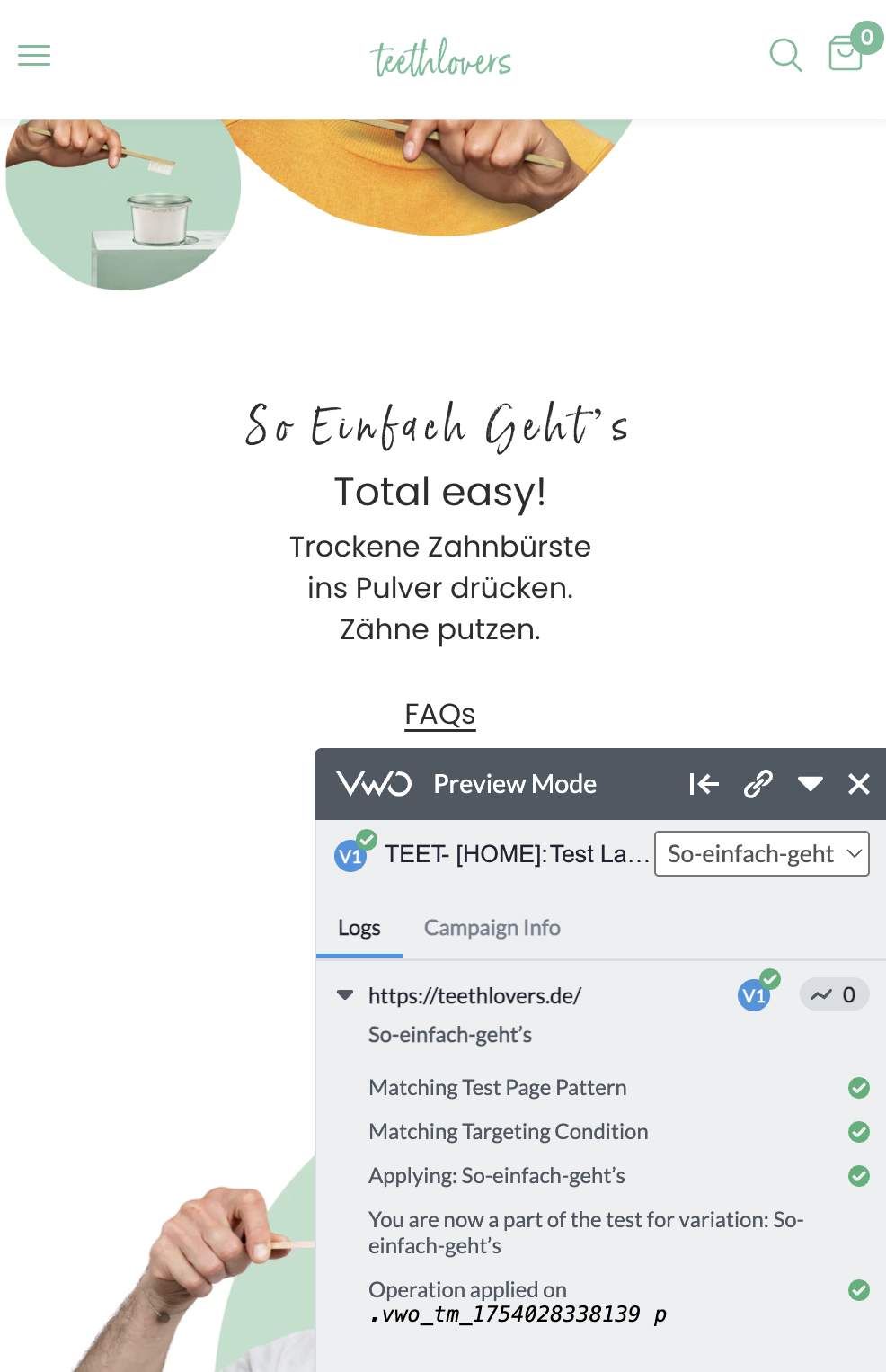
Valentin Yeo