CTRL,
Prioritized the task to High urgency [1].
Loading...
Assignees
The Assignees
Agents
No agents
ID
TEET-133
Status
Failed
Due date
-
Project
Teethlovers
Priority
High
Task size
-
Tags
No tags
 Valentin Yeo
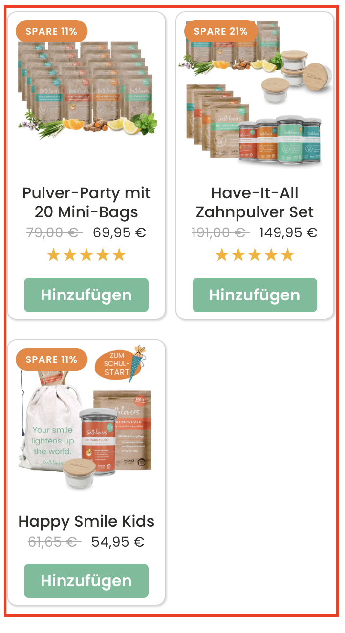
Currently, discounted sets are shown as standard grid cards (same as other products). They may not stand out enough, even with discount badges. This reduces the chance that users will perceive them as “hero offers” worth considering first.
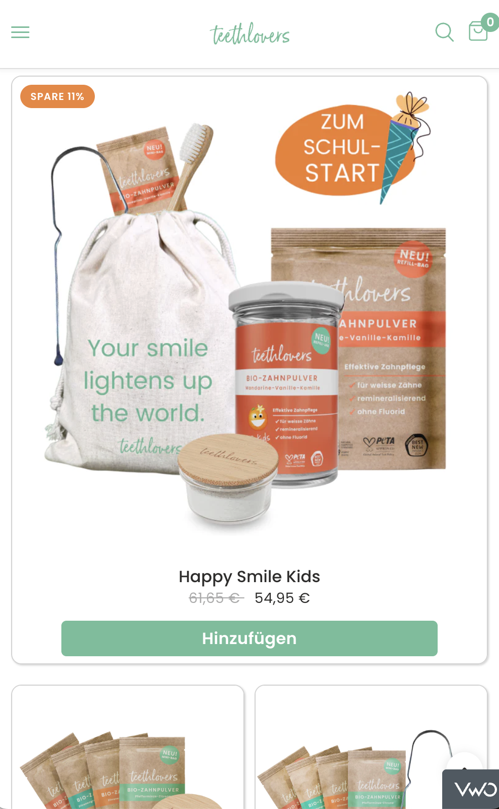
Test whether displaying discounted sets as full-width cards increases visibility, clicks, and add-to-cart rates by presenting them as premium highlighted deals.
If discounted sets are converted into full-width cards, then users will be more likely to engage and purchase them, because larger visuals and emphasis improve perceived value and trust in discounted offers.
Discounted sets shown in standard 2-column product grid, same size as other products.
Show discounted sets as full-width cards (1 per row).
Larger product images + more whitespace.
Impact (9/10):
Big increase in visibility and scannability.
Creates a hero placement effect, similar to featured banners.
Likely to raise add-to-cart rate on discounted sets.
Confidence (7/10):
Strong UX research shows bigger cards = higher attention.
But effect may vary depending on user preference for compact vs. expanded layouts.
Ease (6/10):
Requires layout adjustments in product grid CSS/JS or CMS.
Slightly more dev effort than simple reordering.
Total ICE Score: 22/30
VWO link:
https://app.vwo.com/#/test/ab/138/summary/?accountId=1091932
Valentin YeoValentin YeoValentin Yeo Valentin YeoValentin Yeo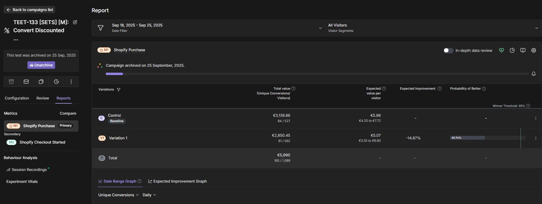
Valentin YeoValentin Yeo