CTRL,
Prioritized the task as High to increase visibility of alternative payment options [1].
Loading...
Assignees
The Assignees
Agents
No agents
ID
TEET-139
Status
Failed
Due date
-
Project
Teethlovers
Priority
High
Task size
-
Tags
No tags
 Valentin Yeo
Problem Statement:
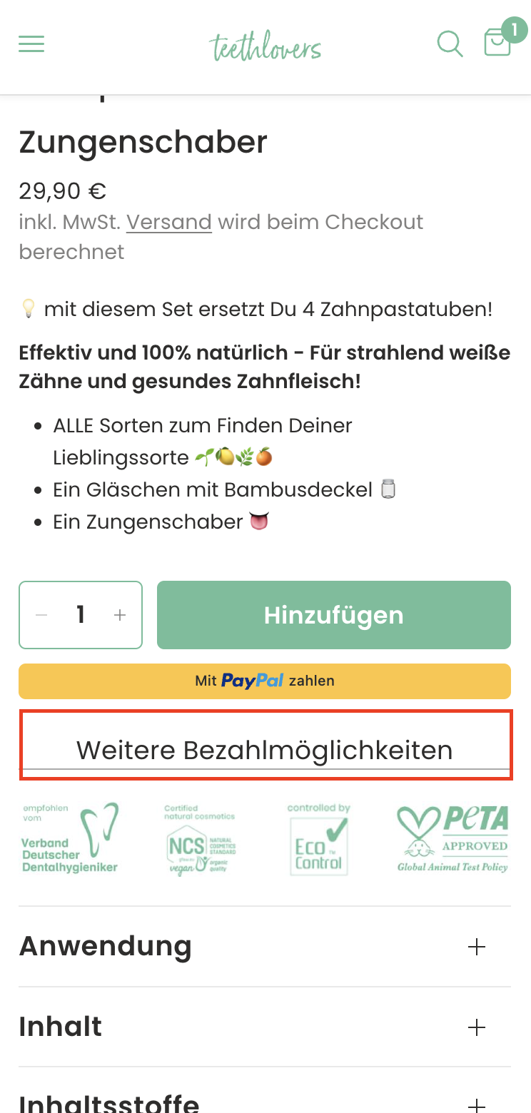
Currently, “Weitere Bezahlmöglichkeiten” appears as a plain text link. It may not attract enough attention, leading users to overlook available alternative payment methods. This could cause friction or drop-off at checkout for users who prefer Klarna, Apple Pay, Sofort, etc.
Objective:
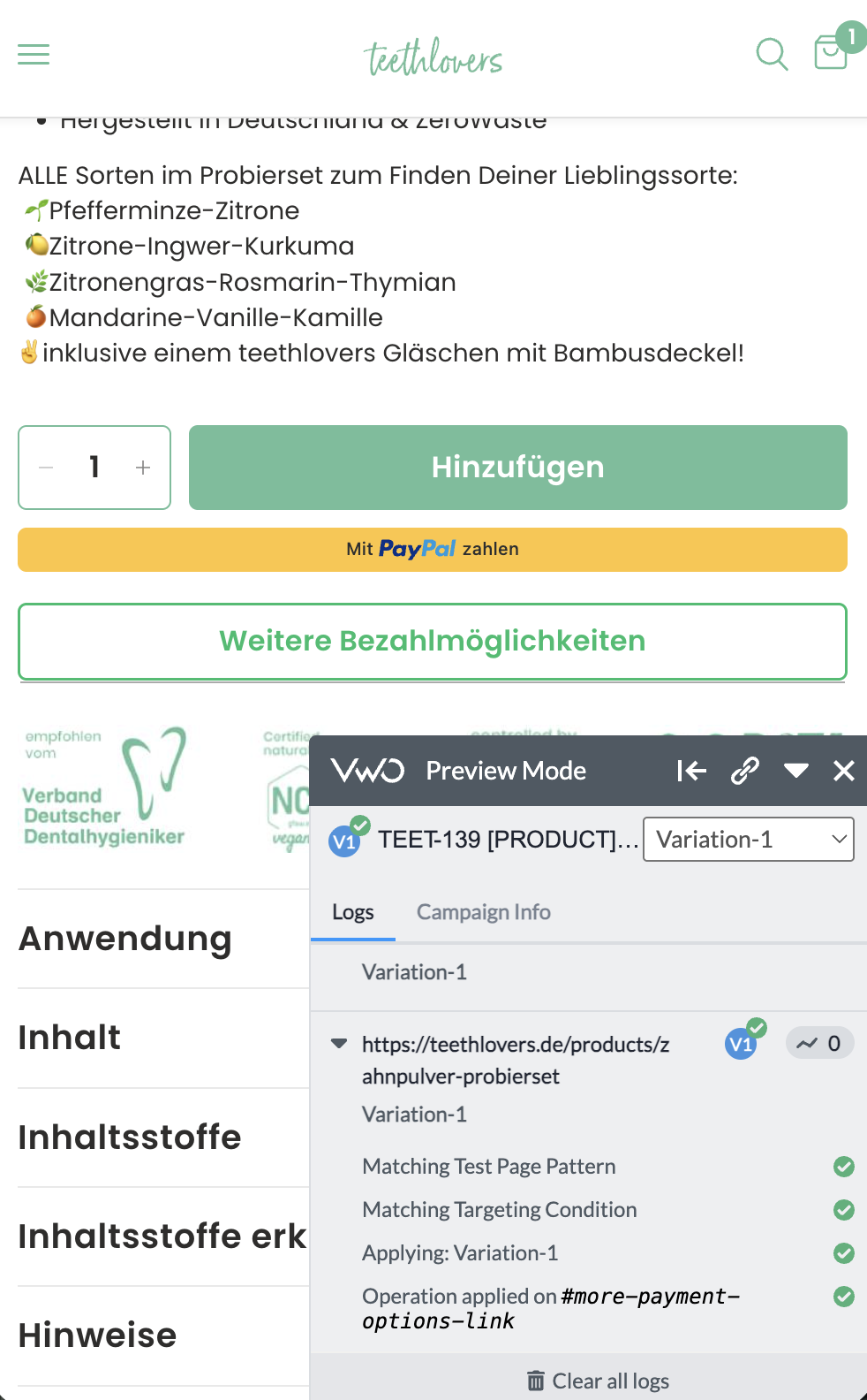
Increase conversion by highlighting alternative payment options more clearly through a secondary button style, making it equally accessible and confidence-building without overshadowing the primary “Hinzufügen” button.
Hypothesis:
If “Weitere Bezahlmöglichkeiten” is converted into a secondary button, more users will notice and click it, leading to smoother checkout for users preferring alternative payment methods, thereby reducing cart abandonment and improving overall conversion.
Plain text link: “Weitere Bezahlmöglichkeiten”
Secondary button style (outline or lighter background than primary CTA):
German: Weitere Bezahlmöglichkeiten
English: Other payment options
Placed just below the PayPal button, visually balanced but distinct from the primary green “Hinzufügen” button.
Impact (7/10): Medium-high. Payment confidence is crucial; improving visibility of options may help users proceed faster. Not as high-impact as the main CTA, but still influences conversion.
Confidence (6/10): Moderate. Best practices in UX show secondary buttons improve visibility. However, uplift depends on how often users seek alternative payment options beyond PayPal and standard checkout.
Ease (8/10): Easy to implement — styling change only, no backend logic needed.
Total ICE Score: 21/30
VWO link:
https://app.vwo.com/#/test/ab/146/summary/?accountId=1091932
Valentin YeoValentin Yeo Valentin YeoValentin YeoValentin YeoValentin Yeo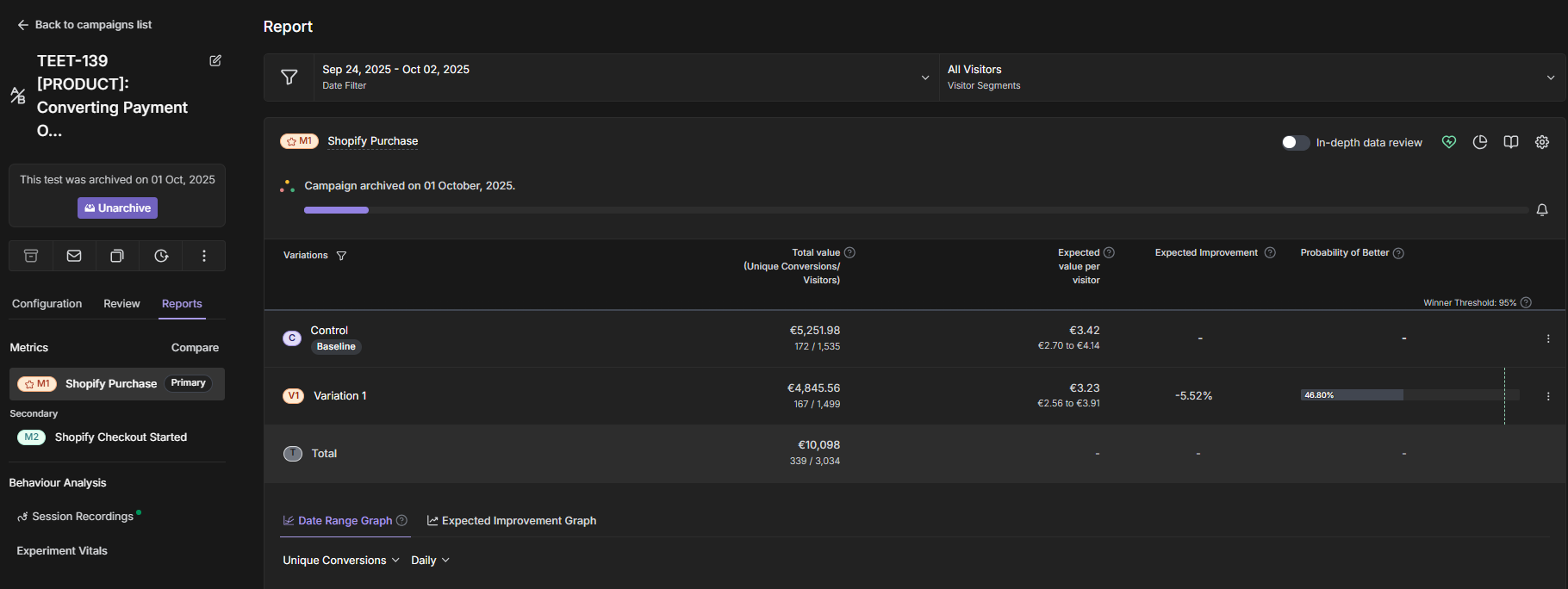
Valentin YeoValentin Yeo