CTRL,
Assigned the label "JETZT STARTEN" to the task, signaling immediate commencement
Loading...
Assignees
The Assignees
Agents
No agents
ID
TEET-127
Status
Failed
Due date
-
Project
Teethlovers
Priority
Urgent
Task size
-
Tags
No tags
 Valentin Yeo
The current “How it works” section (instructions with images) is placed below supporting content. This delays exposure to practical product-use clarity, which can reassure new customers who may hesitate to purchase without understanding how to use the product.
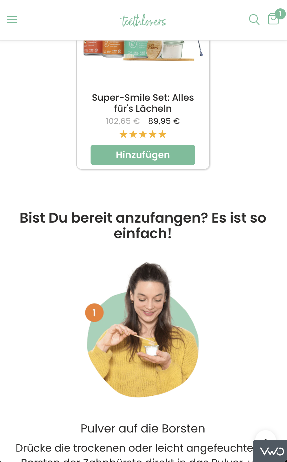
Increase conversions by moving the “How it works” section directly below the product listings, so users see clear usage steps immediately after browsing products.
If we place the “How it works” section right below products, then users will be more confident to purchase because they immediately see how simple and hygienic the product is to use, reducing hesitation and drop-offs.
“How it works” section is placed lower on the page, after other content blocks.
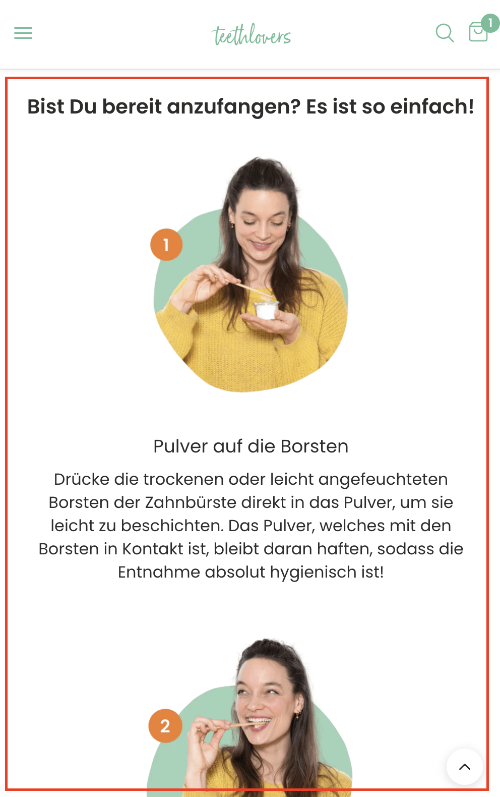
Move the entire “How it works” section (images + steps) directly below products.
Keep formatting unchanged.
Impact (8/10):
Addresses a major hesitation barrier for new buyers (“How do I use it?”).
Likely to improve conversion for first-time customers.
Confidence (7/10):
User psychology supports decision-making when benefits + usability are clear before checkout.
Clarity tests in ecommerce often reduce friction and increase AOV.
Ease (8/10):
Simple repositioning of an existing section.
No new creative required, just layout adjustment.
Total ICE Score: 23/30
VWO link:
https://app.vwo.com/#/test/ab/130/summary/?accountId=1091932
Valentin YeoValentin YeoValentin YeoValentin Yeo Valentin YeoValentin YeoValentin Yeo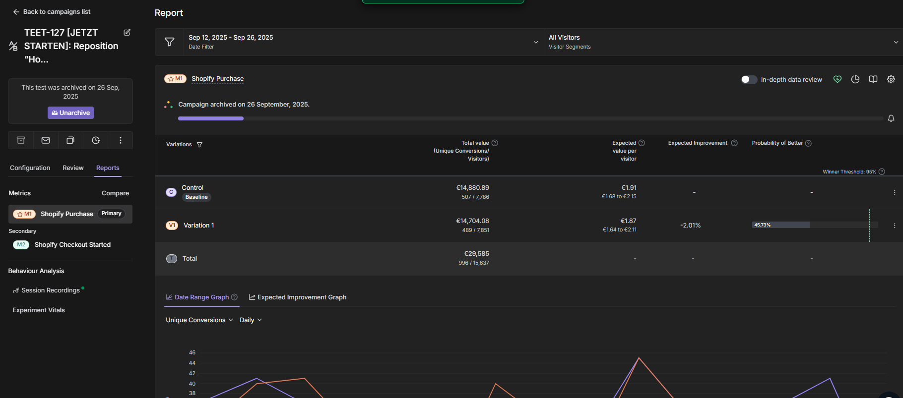
Valentin YeoValentin YeoValentin YeoValentin Yeo